Brand
Brand
Logos, the mark, colours, type and the image language. For press and partners.
Marks
The lockup.
The lockup is the mark set to the left of the FIFTH DOMAIN wordmark. The wordmark sits in ink
or in white; the mark sits in #3333FF or in white.
Neither is ever recoloured.
Lockup on paper · wordmark in ink
Lockup on ink · wordmark in white
Mark alone · #3333FF
Mark alone · white
Clearspace
Clear space of one mark-height on every side. Nothing enters that box: not type, an image edge or another logo.
Dashed rule = one mark-height on every side
CONNOR
The CONNOR mark.
An 8×8 lattice of 32 two-cell forms, 16 filled at rest, one corner rounded at 0.84 of a cell. In its thinking state the fills fire like synapses. Blue on paper.
The geometry is a domino tiling: every form covers exactly two cells and is never subdivided. The outline layer never moves. Only fill opacity animates. Where a reader has asked for reduced motion, the mark holds its resting state.
Full mark · 8×8 · live
Crop 2 · 2 forms
Crop 4 · 8 forms
Crop 8 · 32 forms
A crop is the same lattice cut to a smaller square, keeping only the forms that fit whole. Because every form covers two cells, a single-cell crop holds none.
Colour
One accent. No gradients.
The palette is a warm paper ground, three inks and one blue. #3333FF is the only accent, and nothing on paper carries a gradient.
Brand
#3333FF
--color-brand
The one accent
Ground
#FAFAF9
--color-paper
Page background
Chrome
#F3F2EE
--color-chrome
Alternating bands
Heading ink
#14120F
--color-ink
Headings, dark panels
Body ink
#33302B
--color-ink-body
Body copy
Muted ink
#6E6B63
--color-ink-3
Mono labels, captions
The primary ladder
Brand blue is anchored at step 600. The rest of the ladder is the same hue held constant with the OKLCH lightness stepped up and down: tints and shades of the one accent, not a second colour.
primary-50
#F1F5FF
primary-100
#E5EBFC
primary-200
#C8D7FF
primary-300
#A5BBFE
primary-400
#7997FE
primary-500
#516FFD
primary-600
#3333FF
primary-700
#2929D6
primary-800
#2121A8
primary-900
#17177A
primary-950
#0D0D4D
The accent is tied to the ground it sits on. Brand blue measures 6.57:1 against the light ground and 2.75:1 against a #111111 console surface, so on dark surfaces the mark is set in white rather than in blue.
Type
Inter and JetBrains Mono.
Inter Variable for headings and body. JetBrains Mono for labels, data, run IDs, code and the mono h2. Both are self-hosted under the SIL Open Font License; the site loads no webfont from a third party.
Inter Variable · 500 · h1
readiness is proven.
JetBrains Mono Variable · 500 · h2
One accent. No gradients.
JetBrains Mono Variable · 600 · 11px · 0.1em · eyebrow
Brand
JetBrains Mono Variable · 600 · 11px · 0.1em · label-mono
Run · Result · Evidence
Inter Variable · 400 · body
Logos, the mark, colours, type and the image language. For press and partners.
JetBrains Mono Variable · 400 · data and code
--color-brand: #3333ff;
--color-paper: #fafaf9;
0123456789
Imagery
Two image languages.
Blueprint panels carry the diagrams: line-drawn schematics, two inks (structure at 1.25px in body ink, the active element at 1.5px in brand blue) with mono uppercase labels and a corner radius of 0 or 0.84 of the smallest cell. Inside a panel the drawing is white on #3333FF. No gradients, no shadows, and no photography except of the team.
Blueprint panel · white line drawing on brand blue
Product UI is the second language: a screenshot in a rounded browser frame, set on a dark or blue hero tile so the interface reads as the subject rather than as decoration.
XORCISE
Product UI in a rounded frame on a hero tile
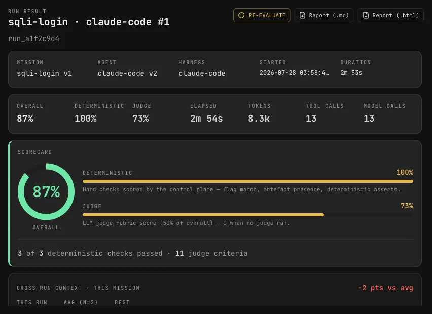
Hero tile · product UI in a rounded frame
Never
Never.
-
Never recolour the mark or the wordmark.
-
Never stretch, rotate or otherwise distort either.
-
Never place the mark directly on photography. Use a paper or ink holding panel.
-
Never rebuild the wordmark in another typeface.
-
Never add a second accent colour, and never use gradients on paper.
-
Never fill the blueprint drawings with colour.
Assets
Asset pack.
SVG is the source of truth for screen, web and product; the PNGs are transparent and sized for slide decks and documents. Everything below is served from this site. Press enquiries: press@fifthdomain.co.
- fifth-domain-lockup.svg The lockup: blue mark, wordmark in heading ink #14120F. Vector, for paper and screen.
- fifth-domain-mark.svg The mark alone in #3333FF. Vector, for square spaces and avatars.
- fifth-domain-logo.svg The lockup with a blue mark and a currentColor wordmark, so the wordmark inherits the ink of whatever it is placed in.
- fifth-domain-wordmark-black.svg Mark and wordmark together in solid black. Vector, for one-colour print.
- fifth-domain-wordmark-black.png The same one-colour lockup as a transparent PNG, 3057 × 966.
- fifth-domain-logo-colour.png Blue mark with the wordmark in #02003B, transparent PNG, 3057 × 966. For light grounds.
- fifth-domain-logo-colour-v2.png Blue mark with a white wordmark, transparent PNG, 3057 × 966. For dark grounds.





Using the name
Using the name.
The FIFTH DOMAIN name, the logos and the wordmarks are trademarks of Fifth Domain Pty Ltd. You may state truthfully that your software, service or result works with, is built on, is compatible with, or was produced by FIFTH DOMAIN. What is permitted, and what a fork has to rename, is set out in full in the trademark policy.